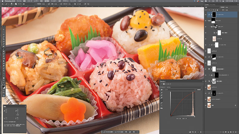
画像処理
画像処理を想定した緻密な撮影が、仕上がり完成度を上げます。
画像処理は、明るさやコントラスト、色彩などの色調整作業、傷や汚れ、映り込みの除去などの修復作業、その他に形状の変形加工、素材画像などとの合成作業等、多岐に渡ります。
必要とされる処理の内容によって、最適なアプローチと手法で行います。 弊社が目指しているのは「画像処理を感じさせない自然な仕上がり」。撮影段階から画像処理に最適な素材を撮れることが何よりもの強みです。ここでは、弊社の画像処理のワークフローの一部を紹介いたします。
モニターを正確に色管理
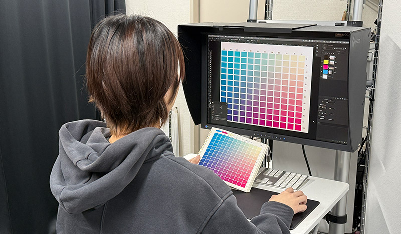
画像処理を行うにはモニターが正確に合っている必要があります。キャリブレーションモ ニターを使用することはもちろんですが、定期的にDICチャートとの誤差を確認し、調整を行なっています。
数値管理された色補正
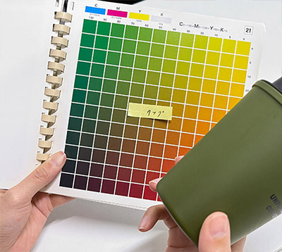
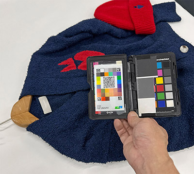
色補正は、ホワイトバランスを正確に合わせ、明るさやコントラストを整えた後に行います。細部の色合わせを行う際、手元に被写体実物があればそれを見ながら行いますが、実物が手元にない場合も多々あります。そのため、撮影時に色見本を作成するようにしています。見本画像を作成する余裕がない場合は、iPhoneでカラーチャートと一緒に撮影するか、DICのチャートで一番近い色を探しメモを残しています。実物がそばになくても細部まで色合わせを忠実に行うためです。
印刷表現を考えたCMYKデータ作成
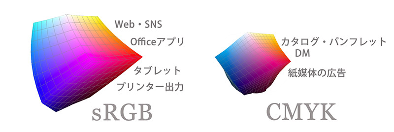
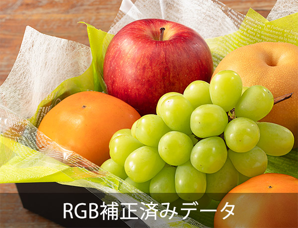
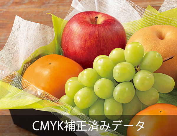
RGBデータを確認した時はキレイだったのに、印刷用のCMYKデータになったら色が沈んだり、くすんだりという現象はよく知られています。特に、鮮やかなネオンカラーやパステルカラー、果物のオレンジやエメラルドのジュエリーは、RGBで表現できても、印刷用のCMYKだと激しい色のくすみや階調喪失が起こります。これらの原因は、RGBの色域に比べて、CMYKの色域が狭いからです。色域外の色再現ができないのです。
アヴェニューAでは、デジタル導入当初から何十年もチャンネルミキサーや演算など、普段は使用しない補正ツールを駆使し撮影のライティングから見直すことでこれらの問題の多くを解決しました。
本来CMYK変換はカメラマンの役割ではありませんが、印刷の写真仕上がりを良好にするために、アヴェニューAでは印刷で使用する写真の多くをCMYKで納品しています。
※CMYK画像は、表示の都合でRGBに再変換しています。
納品はマスターを含めて8サイズ
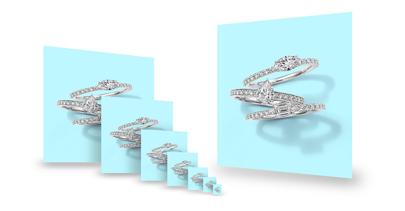
仕上がりデータの納品形式は、RGBとCMYK、ファイルフォーマットは EPS、TIFF、JPEG、PNG、PSDなど様々なフォーマットに対応いたします。 また、デジタルカメラの高画素化に伴い、媒体に適さない大き過ぎる画像を使用することで発生するトラブルを防止するために、納品データは最大サイズのマスターを含めて8サイズで納品しています。 データを使用する際は、できるだけ大きさの合ったデータをご使用ください。8サイズのデータは、上書き防止措置としてファイル名に全てデータの大きさを記載し、大きさ別にフォルダを分けてあります。Macの場合はカラーラベルも付けてあります。
精度の高い切り抜き加工
切り抜き加工は、画像処理の基本とも言える作業です。切り抜きで使用する写真はもちろん、写真を合成したい場合も必要になります。 また、角版の場合も切り抜いてから個別に補正を行った方が、綺麗な仕上がりとなります。 宝石の補正では、石と地金を全て切り抜いて個別に補正を行っています。こうした細やかなひと手間と作業がクオリティにつながります。
表現を広げる影イキ切り抜き写真
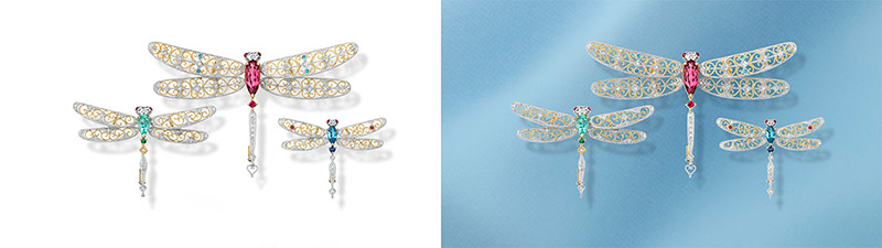
影イキの切り抜き写真をお勧めする理由は、大きく4つあります。
- 角版のような背景色の色被りが起きないめ、商品自体が写真として美しい。
- 背景が白・黒・グレーだけでなく、あらゆるカラーに変更できる。カラーも自由、彩度、明度も自由自在。
- 様々な背景素材と合成できる。
- 単純な切り抜き写真としても使用できる(商品と影は別なレイヤーなので簡単に影を消せます)。
角版でカラー背景のイメージ撮影を求められることもありますが、背景が無彩色(白・黒・グレー)ならまだしもカラー背景や柄物背景の場合、どんなに優れたライティングやセットで撮影しても、商品に背景色の色被りによる濁りや映り込みが発生し、画像処理やその後のデザイン工程でも様々な制約を受けることをご承知おきください。
影イキ切り抜き写真なら商品の美しさはそのままに、背景も自由自在。仕上がった全体デザインと調和させるために背景色を微妙に調整することも容易にできます。
自在な色変換
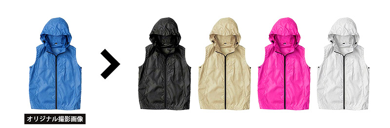
カラーバリエーションの制作は、撮影時にコントラストを変えて2枚の画像を撮影します。 画像処理は最初に色変更を行う部分を正確に切り抜き、マスクを作ってから撮影した2枚 の画像を使用して色を変更します。明度が近い場合は比較的容易ですが、明度が異なる場合は一手間かかります。 従来は難しかった白から黒、黒から白といった極端な明度変更も撮影から行えば可能です。
細部にこだわる別撮り合成
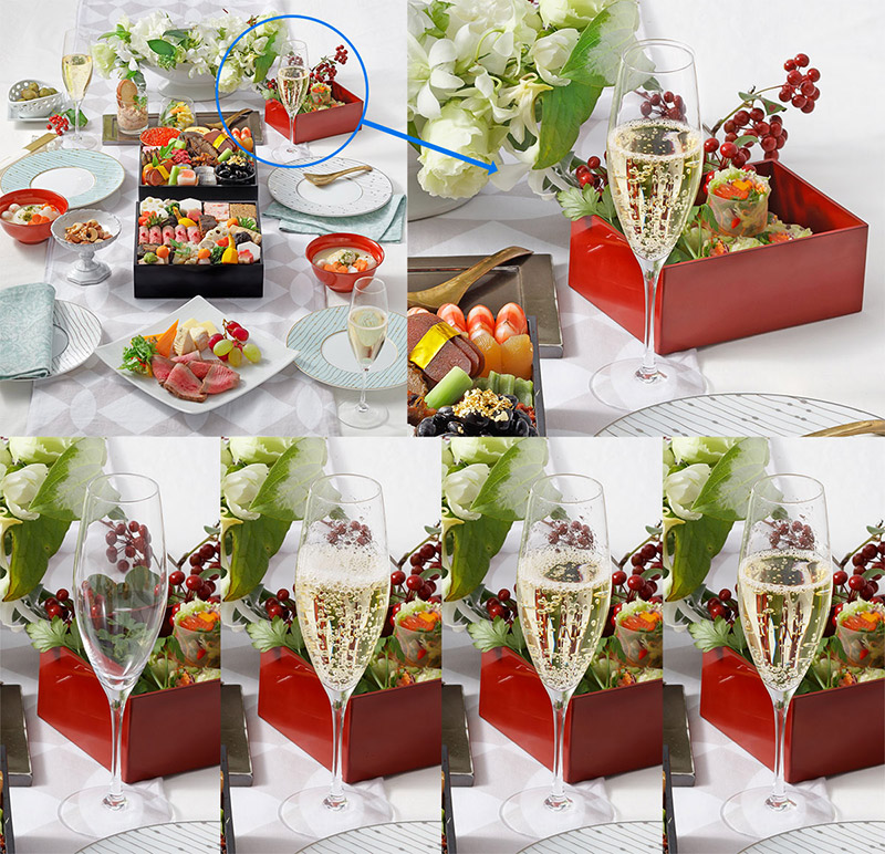
別撮り合成とは、カメラを三脚に固定したままライティングや被写体の一部を変更して撮影し、画像処理でそれぞれ良いところを切り抜いて、重ね合わせることです。一発で撮影することが困難な場合にもこの方法を用います。 一見「合成なし」にみえる弊社の写真でも、別撮り合成を行なっていることが多いです。
例を上げると、シャンパンや炭酸など泡の出る飲料の撮影です。 グラス一つであれば比較的問題ありませんが、複数のグラスがある場合、同時にタイミングよく注ぐことは不可能です。そうした場合、順番に注いでその都度一番良い状態で撮影を行い、後で画像を重ねて 1 枚に仕上げます。 さらにシャンパンの場合、そう単純ではありません。グラスに注ぐと勢いよく泡が立ち、液面で泡が飛沫となってグラスの内側に付着し、見た目が美しくありません。この飛沫の始末は、動かさないようにグラスの内側を拭いて綺麗にするか、最初の空のグラスデータを使用することになります。液面の良い状態も必要になります。作例では、たった一杯のシャンパンのために4枚の写真を合成処理しています。
当スタジオはジュエリーや食品の撮影が多く、チェーンの細かい切り抜きや、映り込みの激しい商品、透明なパッケージなどの画像処理を多数行う中で、高難度の切り抜きを数多く行い、技術を蓄積してきました。 一見画像処理の有無がわからない仕上がりこそが、優れた画像処理と考えています。